Analyze and Share data, visually
Salt is a library for creating interactive visualizations of massive datasets.
Visualizing big data is hard. Usually this means creating highly aggregated visualizations that can conceal localized patterns behind sums and averages. Salt helps you scalably transform your data, so that it can be explored interactively at increasing levels of detail.
Salt generates scalable representations of billions of data points, enabling visualizations including geographic heatmaps, cross-plots or time series, and the layering of multiple data sources and dimensions for contextual overlay.

Scalable: Create interactive visualizations of datasets in the billions of records

Analytic Layers: Layer custom analytics and aggregations from multiple datasets

Tiles: Efficient, generalized data representations for more than just maps
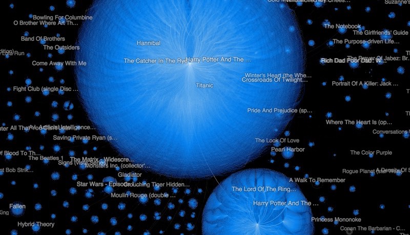
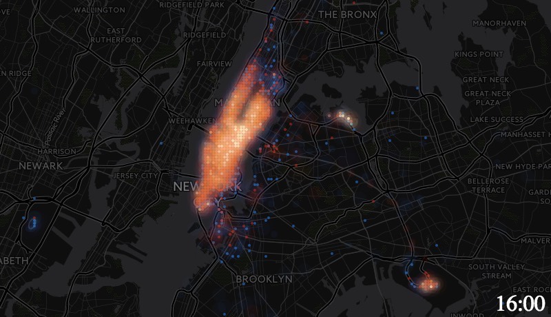
Salt enables the visualization of non-numeric data as well with custom, flexible analytics for keywords, topics, sentiment, and more. Above, top Twitter hashtags have been plotted in word clouds by region above the a dataset of 187 million New York taxi trips. Zooming in de-aggregates the word clouds, allowing you to explore local trends, while zooming out gives you a high-level overview of hashtag usage in the New York City area.
Flexible Inputs, Flexible Outputs
Building on the flexibility of Apache Spark, Salt is capable of ingesting data in a wide variety of formats and schemas. For example, a 2 million node, 10 million link graph in GraphML format is rendered using Salt in a web-maps-like pannable, zoomable interface with trillions of points of resolution. We chose to render edges using binning rather than overplotting which ensures that dense cluster structure remains visible.
Salt divides up results into tiles of aggregated data representations. The coordinate system (2D geographic, 2D cartesian, 1D time-series, etc), data format, serialization, and storage are flexible and totally up to you. For example, we took the same taxi data from above and generated tiled data output compatible with the Torque TileJSON format to created an animated time-bucketed view of a day of taxi activity. Try it yourself!
Ready to see your data?
or contact us for more information.